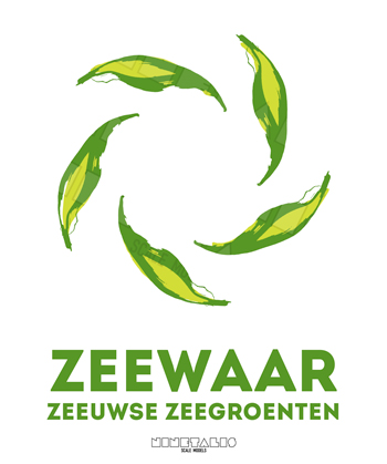
Zeewaar corporate identity
You may not realize, but seaweed is part of your daily routine. Sea-what-now? Yes, we are most definitely talking about that green stuff floating in the ocean. Yoghurt, soup, toothpaste and even shampoos are products that often contain some amount of seaweed in them.

However, most of these weeds are taken straight from the ocean ‘in the wild’. As such it is near impossible to trace their origin. It is also an unsustainable process, since hundreds of tons are being removed on a daily basis without any form of reimplementation of the removed flora.

This is where Zeewaar comes in. The brainchild of two women who run their own ‘seafarm’ in the southern region of the Netherlands. Thanks to their methods of production their products can be traced, checked and grown in a sustainable way.

These key elements ultimately formed a basis for this (school based) corporate identity project. The continuous loop of leaves in the logo represent the never-ending cycle of one single plant, which usually starts out from one single ‘leaf’ of seaweed. Using various Chinese ink drawings, several layers where combined into a single logo seen above. The leaf design was also reused as a design element inside which could be used for the protection of the confidential letters.


