With my previous post I have spend on time on colours and their accuracy from production and reproduction standpoint and standardisation. This time I would like to focus a bit more on their application with combat aircraft in the field.
Accuracy of paints
So the question you all have. Is German Grey 2 from this generic paint branch the most accurate or not? The answer may ever so frustratingly be yes and no. While these paints give you an accurate tone, it is not the one and only Devine tone.
Don’t get me wrong, if you’re using a light warm grey where the standard colours are known to be dark cold grey, it’s just plain simple wrong. But there is some give and take on these tones.
Remember my industrial standards point from my previous post? Even during peacetime and using the most modern technologies, perfect consistent recreation of paint colours has proven difficult to achieve at times, even at the producer’s own factories.
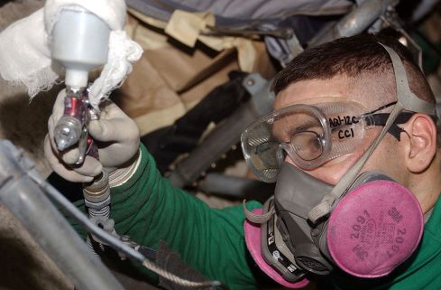
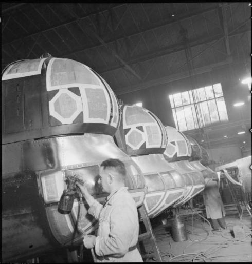
The same thing can be said during ground crew maintance. Most of the time they wouldn’t have cared if the tone is a little or way off. In the end, their job is getting these aircraft ready for service or battle. Nobody is going to shed a tear over ‘the exact tone’ the machine is painted in. Even more interesting with some cases is when a second layer of paint would peel off and the aircraft ends up with this weird ‘duo-tone’ colouring as seen on the Syrian Spitfire, or creates uneven peeled edges as seen on the leading wing edge of the Spitfire Mk V above.
Even official documents from less than two decades ago provide a great look into this when it comes to paint and colour integrity. I’ve been reading some of these documents, mainly from the USAF, but one line in particular stood out to me.
“Aircraft determined to have a sound paint system already applied will not be repainted solely to incorporate color, improve appearance or material changes to the standard paint system and color scheme as listed herein. When it is necessary to perform maintenance on such aircraft with former standard or non-standard paint (unless deteriorated to the extent that complete replacement is required), use like or same type material as originally applied for maintenance painting purposes.”
That’s directly quoted from an official document called the T.O. 1-1-14 Technical manual: Exterior finishes, insignia and markings, applicable to USAF aircraft.
Basically it says that repainting aircraft just for the sake of ‘the correct colour tone’ should not be attempted and that paints that resemble the colour can still be used, even when they are not completely alike.
It then goes on to state several rules when aircraft need sectional overcoating, total overcoating, or strip and paint procedures. And maybe surprisingly, the document includes nearly a hundred of camouflage paint schemes, which suspiciously look a lot like the drawings found with older model kits.
If you have any interest in building USAF aircraft or helicopters I highly recommend you to check these types of documents. There are dozens like this out there with this kind of information or camouflage schemes.
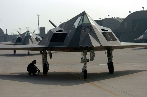
Another thing I often think about is the colour integrity of radar absorbing paint like that found on the F-117, F-22 or F-35, of which no doubt the contents needs to be perfectly mixed and applied for other reasons than their looks. Yet at the same time we can also question the importance of that colour tone and wether or not that tone itself needs to be perfect for it to be effective (I would like to know though).
What I do know so far is that even this paint is prone to weathering and peeling, as was recently outlined by several media sources about the F-22 used above Syria, as paint starts to ‘wrinkle’ and peel which interferes with the effectiveness of its stealth capabilities (source).
Modern paint quality and integrity
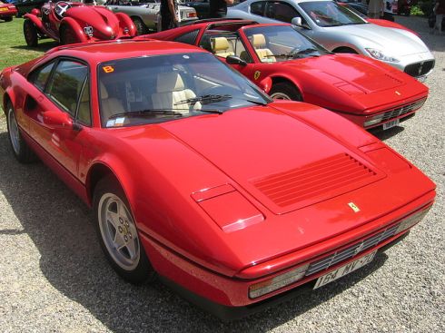
We should also note that the last decade or so we have gotten pretty darn close to perfection when certain manufacturers like Ferrari put their mind to recreating a certain colour over and over. Some might remember my Coca Cola referencing during the last article where I stated something differently, and would now love to question my knowledge as I am now stating the opposite.
I still stand by that Coca Cola point. But this time I’m talking about hand build, high-end performance cars, where that colour is their thing and you pay BIG MONEY for it. That’s why it’s a pain to repair body damage on them, as just replacing a panel could set you back as much as $30,000 or more. That’s basically a brand new pick-up truck. When you buy something like a pickup or a simple sedan, the results tend to be quite different.
Just try to repaint or replace a bumper on your own car. Using parts from another car that was produced in a different year or batch can be a perfect match if you’re extremely lucky, but usually it is worlds apart.
This is the same with combat aircraft. I spoke with a mechanic of the Belgian Air force (who is also a fellow model builder) about the colours on the aircraft he works on. These are the Savoia Marchetti SM260 trainer aircraft, which are kept in tiptop display condition with colourful paint schemes. As most of them serve as display and training purposes, these have been painted in bright yellow or red for a few decades now.
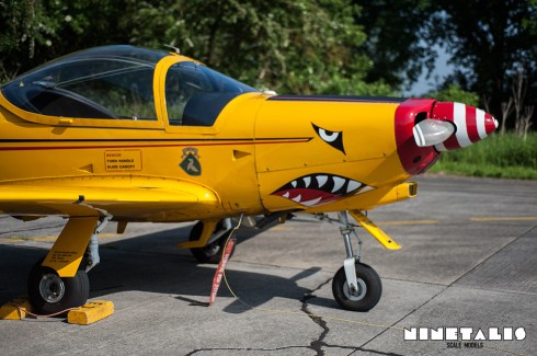
So I asked him how much effort was being spent on having the exact right colour on the aircraft. He looked at me, a little bit baffled by what I asked him. “Well, we’ve been using three different yellows by now.”, later on adding, “We first had (insert manufacturer) providing us the paint, but they’re not around anymore and we have been forced to switch manufacturers and therefore use different colours”. “It’s not an uncommon thing, look at the F-16’s or the Army’s Unimogs. The colour tone is not THAT important, the important part is that the machine looks presentable and is protected from the elements. My superior won’t lose sleep at night because the colour is ‘off’, and neither will I or my colleagues.”
Another colleage of his who is an actual painter of the Belgian Air Force C-130’s told me they recently discovered that they had been using the wrong paint code since the aircraft’s introduction with BAF.
Now this is all talk and you don’t need to take my word on it, but here is a visual example. The Westland Seaking, where tail rotors have been switched between aircraft showing the colour differences. An effort not uncommon with Seakings from other air forces as well.
Think about it, How many pictures do we as modellers looking for references see on a daily basis where (swapped) panels sport completely different tones from one another? Examples of this run into thousands from RAF to JASDF aircraft on the other side of the globe.
A final example of ‘painted in the field’ are the pink recon Spitfires from World War II you might (or might not) be familiar with. The pink colour was chosen as it would merge into the sunset sky. Obviously though at the beginning the RAF didn’t have buckets of ‘pink reconnaissance paint’ or what we modellers know as ‘PRU Pink’ laying around at that time.
So the next best thing was to mix the red insignia paint with white (insignia) paint, creating a somewhat light pink-ish colour that would vary in tone between batch or aircraft, a little bit like the Desert Storm Tonka’s or Jaguars. While not the norm, it is a great example on how things were ‘winged’ at times.
 Photograph by Yetdark shared with a CC BY-SA 2.0 license
It’s also a perfect example on the interpretation of colour accuracy nowadays. Though these aircraft were usually light pink (basically red-ish broken white) and not bright pink , you will often see the colour reproduced on warbirds and scale models as an extremely vibrant ‘princess pink’ tone. It’s all okay if it floats your boat, but it isn’t ‘accurate’ at all.
So no, you can’t just slap any colour on your model and proclaim ‘artistic freedom’ when it’s just completely wrong. At the same time you can’t go screaming at the guy who actually does, since the idea of this ‘standard’ or the lack of it works both ways.
Why you should actually know all this?
Though it is certainly good to set a certain degree of accuracy that you want to achieve or recreate, it is easy to drive yourself insane and start personal crusades on book producers and simple ‘hobbyists’ or having this illusion that this 10 dollar jar of paint is the only tone of Russian tank green used during the war. Actually mixing paints together and eyeballing them usually gets you a better and more interesting result once applied.
I can tell from own experience that, while I’m somewhat ignoring the ‘standards’ with colours, I get genuinely positive reactions. And that’s even from more talented and knowledgable people who may or may not even be active on the internet with varying pedigrees to the subjects. (Aka they work(ed) on the actual machines, they’re decorated/renowned model builders, they’ve written books on aviation, etc.)
And yes, they also speak their mind if the colour is off.
Admittedly, I do get it wrong at times like when I painted my Red Baron Fokker weekend build in high-gloss Ferrari red. But that’s okay because I learned from that experience and found out myself or people told me in a constructive and polite way.
After all is said and done
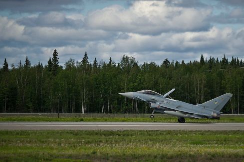
These last two articles are by far not an excuse for you to be lazy and throw whatever colour you want on your model. Sometimes it is important that you do get the right colour when, for example, you are making a unique race car or modern jets like the one of a kind 2014 Luftwaffe Tigermeet Eurofighter Typhoon.
But when you’re building one of the thousands T-34’s produced in 1942 or a P-40B from Pearl harbor, you can rest a little easy on these colour things and actually mix it up a bit.
These last two articles are by far not an excuse for you to be lazy and throw whatever colour you want on your model
….
But being aware that these colours are not the one and only Devine tone gets you a step further in the learning process.
The thing is that you shouldn’t get lost on paints to such a point that you can tell the difference wether someone else has put a little to much of a certain pigment with his Russian green 4. And it’s also understandable that some people just looooove to ‘shittalk’ on others to make themselves feel better. I can’t help but feel a little sorry for you that you can’t simply enjoy a good build anymore based on your belief of a standard that was near impossible to reproduce perfectly and consistently in the first place.
Don’t get me wrong as it is definitely no problem these paints are out there and I couldn’t do without them myself. It (rightfully so) makes life a lot more easier for most of us. But being aware that these colours are not the ‘one and only Devine tone’ gets you a step further in the learning process.
Although accurate to some degree and needed in some cases, the only thing it really does is set a standard for a standard that wasn’t largely in place like we know today.
Using the exact same colours as everybody else creates this monotone palette of builds to such a degree that using a little different tone seems to wake people up, wether they realise it or not. In a way this is the artistic freedom you should abuse for being actually more accurate. So instead of buying these paints and blindly applying them and as such calling yourself ‘a pro’ on these colours, take them and work make them your own. All the while you are researching as much as possible and remembering that the information you’re working with will always hit a technical limit at some point.
I hope some of you enjoyed these last two articles and learned something from it.
Here’s part 1 if you hadn’t seen it before
Can’t get enough? Here’s some more great stuff and sources about colours!
- RAAF Foliage Green A Brief Discussion
- Colors & Markings of the Hawker Sea Fury, In Royal Canadian Navy Service, 1948-1956 Part One
- Capital Ship Paint Schemes of the Imperial German Navy in World War I
- RLM – Colors of the German Luftwaffe
- THOMAS BERRY COLBY
- MiGs and Mils, Cockpit Color
- Color Systems – RGB & CMYK
- World War II color picture gallery – IPMS Stockholm
- Urban’s Color Reference Charts Part I – IPMS Stockholm
- Urban’s Colour Reference Charts Part II – IPMS Stockholm
- The Combat Workshop


