
Those who follow my builds and read my articles from time to time know that I don’t go hardcore on paint colours. And there are several reasons for that. But I figured I should elaborate on the reasons why because as I am sure some would love to say, it isn’t because of laziness.
As a (Graphic) Designer and somewhat ‘forced-to-be’ Art student at the same time, you learn a lot of things when it comes to colours. Like how they used to be created, produced today, recreated on screens, seen by our eyes, what they may or may not convey, to even the actual psychological effects they trigger in your brain, just to name a few things.
As such, below I will try elaborate in easy terms on maybe the four most important reasons why you shouldn’t go too hardcore into accuracy of paint tones and why the idea of colour accuracy is quite complex and just that liiiiittle bit more complicated than a simple ‘this is right and that is wrong’.
Photographs
Put short and no doubt about it, photographs are relatively the most easy and accurate references we can get when it comes to paint colour.
Yet, photographs aren’t everything. When looking at photographs you need to keep in mind that, much like what you see with your eyes, photographs are a composition of colours created by the visible light tones that we, or the camera lens, can see. Think of how we can see red but we can’t see infrared.
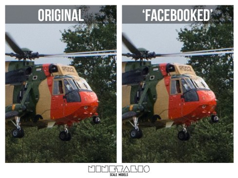
An example, recently I was able to photograph a Belgian Air force Seaking Mk.48. While taking pictures I noticed how the green differed A LOT between real machine and my photographs. While the brown sand colour was a good match, the green colour was just completely different. Even attempting to recreate the green tone afterwards proved quite hard (I will go more into detail about that later). The added picture is a good impression of the colour difference. While I’m used to seeing the colour on the left on images on the internet, the ‘real green’ on the right is in fact closer to the actual green.

You can even go and check google images to show most of the green being closer to the left one opposite to the ‘more correct’ one colour on the right. I even started doubting my own memory (though it was just a few hours ago) and asked a few of the crew I knew later on. Most felt the tone on the right to be the more accurate of the two.
So by the time pictures get uploaded to the internet, you are talking about colours that have been photographed, digitalised, then edited, resized, compressed and maybe even compressed again by the hosting website (this is especially the case with Facebook).
This means that these photographs are edited so much that little details will change with almost every step, and that even subtly affects the colour tones after a while.
Screens
But why does this happen? As we mentioned how light enables you to see colours with your eyes, computer and television screens use light to recreate them (with an additive color system called RGB: Red – Green – Blue). Because of this, not all real life colours can be recreated on your screen and vice versa, as visualised by the graphic below giving an impression of what colours we can see but can’t recreate with CMYK and RGB .
As you can see there are many greens that we can see but screens can’t reproduce. Just think about how many tanks and aircraft are painted in green…

So in order to keep this distortion of colours on screens to a minimum, these screens should be calibrated every few weeks or so. But the thing is that 95% of the screens will always be off, calibrated or not. This is especially the case with household displays which you’re using right now reading this article. Screens you’ve probably haven’t replaced in months or even years. And even the most professional accurate and calibrated screens for printers and designers, specially made to tackle this problem, will still be that one tiny bit off. Although even the most trained eye would have a difficult time noticing that colour difference in such a case.
The same can also be said when printing books in CMYK (A subtractive color system using Cyan – Magenta – Yellow – Keycolor or black, in essence they subtract colours from blacks to create colours instead of adding layers of light).
As such it takes a huge amount of work to accurately recreate colours and will rarely be attempted, because more colour layers would have to be added and the costs would be irrationally high to us and therefore not cost-effective. As such most printed material will be printed in CMYK and have some loss of colour accuracy. Exceptions to the rule are colour cards, like the ones which you can pick your car colour from.

Standards and pigments
I have touched this lightly once before in a previous ‘rant’, standards and when they were introduced. I mentioned something in the likes that “industrial paint standards between factories weren’t really introduced until the later half of the 1950’s”. The first types of material standardisation as we know were introduced around Germany at the start of the previous century by the Deutscher Werkbund. The matter of ‘paint buildup standardisation’ and pigment systems were created around the same point in time by other organisations, but weren’t really widely in place until roughly the fifties.
And the fact of the matter is that some of those standards are still not standardised in some other places around the world. For example the widely used A4-sized paper is still not widely standardised around the US. But let’s go back to colours, even for our over-engineering German friends it was a lot of work to get colours completely correct during the war due to pigment shortages between factories. So while a factory in Berlin could have been producing a steady stream of a single tone, that tone might differ with paint from a different factory in Munich doing an equally good job in creating a steady stream of a consistent single tone.

Nowadays technicians know that a colour can be perfectly recreated by using X amount of colour A, B and C to recreate a certain colour. And although the CMYK system was discovered at the beginning of the 20th century, and as said before most of these types of systems weren’t generally in place until the second half of last century.
Before that time, people would recreate tones by eyeballing the colours and recreate them through samples they got from higher-up, using more than just 3 or 4 ‘standard pigments’ and likely without a perfect technical description, if any were even used at all. As an example, below is a colour chart on dazzle camouflage for ships, officially issued by the British government in 1922. Note the lack of a technical description of the colours and just stating something as ‘2 Blue Grey’ or ‘0 Grey pink’ with a colour sample. Same goes for this ‘Colour-Card’ used by the Kriegsmarine-Shipyard Wilhelmshaven in 1944 (source) or this paint manufacturers Spartan Paints Colour Chart for the RAAF (source).

But for the sake of the argument, lets say in certain cases those systems were in place. You still need to weigh these pigments to a very accurate point, but scales weren’t able to get such accurate results until digital versions were invented. Before that introduction these natural pigments were weighed by hand and mechanical scales, causing tones to be ever so slightly different. Just remind yourself about the everlasting discussion of what the ‘exact tone’ of Olive drab is! Not only are there a dozen genuine variations, a single variation consisted of another dozen tones within itself.
Modern day standards compared
A more everyday example is the red on a Coca-Cola can. This colour should be the same on the American, Asian and European continent. For the manufacturer the red colour is just as important as (or maybe even more than) the logo itself. While Coca Cola sets a relative high standard on their colour tone and make their packaging undergo a tremendous colour standards check, they do tend to ever so slightly differ between factories, countries or continents. Sometimes because of calibration differences, though sometimes even done on purpose.

Then we haven’t even touched the limits of the materials. Just check how the red on a metal can will be different from that on a plastic bottle in your supermarket row. This is just because of the simple reason that it is printed on a different material. Anyone thinking about why we use primer and why it is important right about now? (Besides the fact that it should also make the paint adhere more to the plastic).
This indirectly also means that the previous colour cards are not exactly a great references to get your colours from. Samples on a flat sheet of paper will behave differently than paint used on a 3 dimensional metal object. Not to mention that these samples are pushing 80 years or more in age and will have lost some or their pigment and vibrancy over time.

But let us go back to Coca Cola. Even if the prints would be completely alike, the effects of sunlight and erosion on paints and pigments is extremely brutal. While ink on plastic and metal cans is not the same as paint on aircraft or tanks, the same principles of erosion apply even more on them due to the ‘storage’ differences. There is a huge difference between drinking bottles stored inside warehouses as opposite to aircraft or tanks stored in the field or on the runway during war (or peace) time. So even when paints are perfectly the same, they undergo different natural effects between one another causing slight variations.

We can of course question if Coca Cola red is a good example for the subject at hand, and it isn’t really. It just shows that even when standards are thoroughly put in place there are still limitations. Something closer to home would be the example of these Mil helicopter cockpit panel colours (source). Even though the panels were painted in the same factory during the later half of last century, there still is big a tonal difference between the panels themselves. So much for factory standards ‘ey.
So when is the good stuff coming?
There is just to much stuff to talk about and this would otherwise become a full blown post the size of an academic paper. But if you made it this far, good! It means you actually care and want to learn, which is probably more important than the actual article.
Currently I’m working on a second part to this subject, and next time I’m going to talk about some more military-related things on colour accuracy. So keep an eye on the Facebook page to be prepared when that hits. Until then, let me know anything you wish to add in on the subject. For me this blog is not only about me rambling about things, but to inform and start a discussion.
 Jul. 24, 2002. Mechanic 1st Class Jim Deliman paints the ejection seat warning sign on the side of an F/A-18 “Hornet” strike fighter. Photograph is part of the Public Domain.")
Can’t get enough? Here’s some more great stuff and sources about colours!
- RAAF Foliage Green A Brief Discussion
- Colors & Markings of the Hawker Sea Fury, In Royal Canadian Navy Service, 1948-1956 Part One
- Capital Ship Paint Schemes of the Imperial German Navy in World War I
- RLM – Colors of the German Luftwaffe
- THOMAS BERRY COLBY
- MiGs and Mils, Cockpit Color
- Color Systems – RGB & CMYK

One thought on “What you didn’t know about colour research”